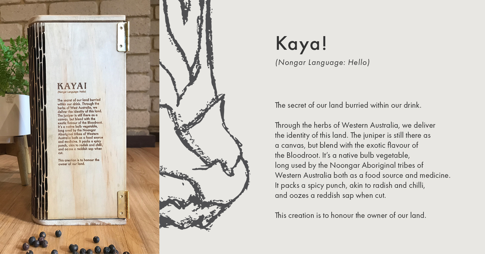
Through the herbs of Western Australia, we deliver the identity of
this land. The juniper is still there as a canvas but blends with the exotic flavour of the Bloodroot. It’s a native bulb vegetable, long used by the Noongar Aboriginal tribes of Western Australia both as a food source and medicine. It packs a spicy punch, akin to radish and chilli, and oozes a reddish sap when cut.
This creation is to honour the owner of our land.
Challenge
Final Year study assignment – Australia showing no signs of slowing down when it comes to the gin and distillers are keeping up with demand by creating original flavours from local ingredients. However, there are now hundreds of gins for consumers to choose from and not all brands can survive in a crowded market
TARGET MARKET
Primary Audience : Australian Market (18+)
Secondary Audience : International Market (18+)
01.
Ideation
The idea came after I learned about one of WA’s iconic gin brands, The West Winds Gin from Margaret River, Western Australia. The brand and quality are good, so I chose them as both a reference as well as a competitor.
Challenge The West Winds Gin Story
The West Winds Gin has a strong brand story that gave me ideas to challenge their narrative. Since my goal is to create a brand that can represent Western Australia, I tried to find unique ways to achieve this goal in a sustainable social context.
Discover West Australian Narrative
I began to challenge the narrative of The West Winds Gin by focusing on building a Western Australian identity from the Indigenous narrative.
After some industry research and the Gin trends on the market today, I firmly believe in featuring a native West Australian botanical as the main flavour of this Gin.
02.
Featuring Bloodroot
Bloodroot is a native bulb vegetable, long used by the Noongar peoples of Western Australia both as a food source and to help with dysentery, mouth sores and toothache.
Common Name
Bloodroot, Bohn, Meen, Mardja, Menang
Scientific or Latin Name
Haemodorum spicatum
Taste Profile
Bloodroot packs a spicy punch, akin to radish and chilli, and oozes a reddish sap when cut
03.
Brand Identity
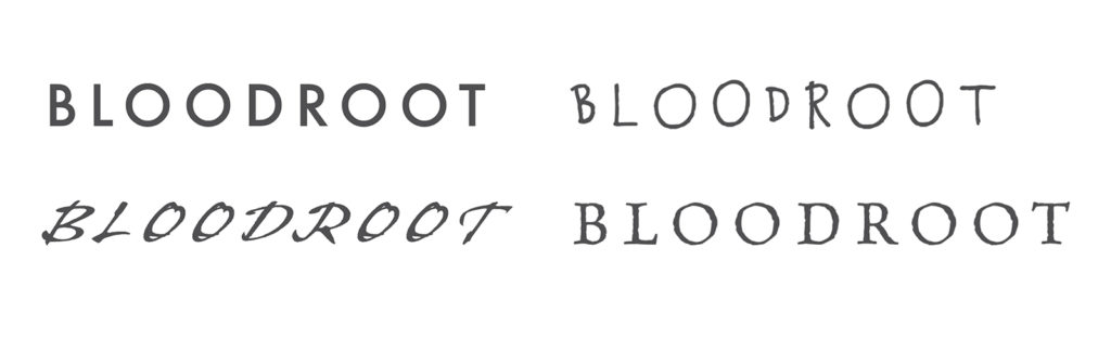
At this stage, I started to explore several different illustrations and typography to create the brand name and logo.
Explore several illustration styles
Explore several fonts
04.
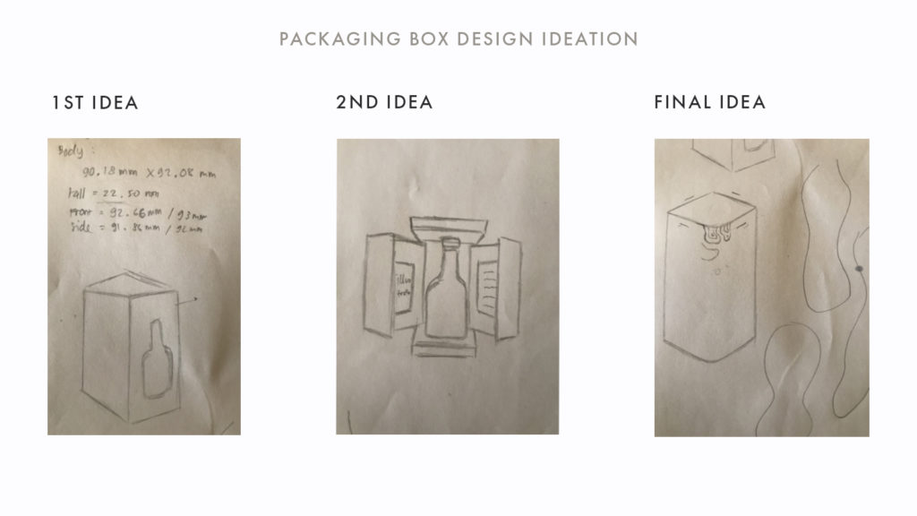
Packaging Design
Bringing the unfamiliar flavour to the distillery industry can be challenging, especially when the ingredients is not popular yet for the public. However, that is the reason why we create this brand, to share the untold story of our land.
For that reason, the packaging design heavily focusses on the illustration of the Bloodroot and brings the feeling of nature in a striking and eye-catching wooden design.
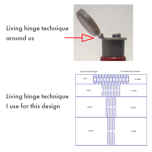
Living Hinge Technique
In addition to achieve the striking and eye-catching design, I use the Living Hinge Technique for the box.
In most product design, a living hinge is a small web of plastic between the cap of a product and where the cap attaches to the rest of the product.
However, for this box, I use different approach of Living Hinge technique to make the plywood more flexible.
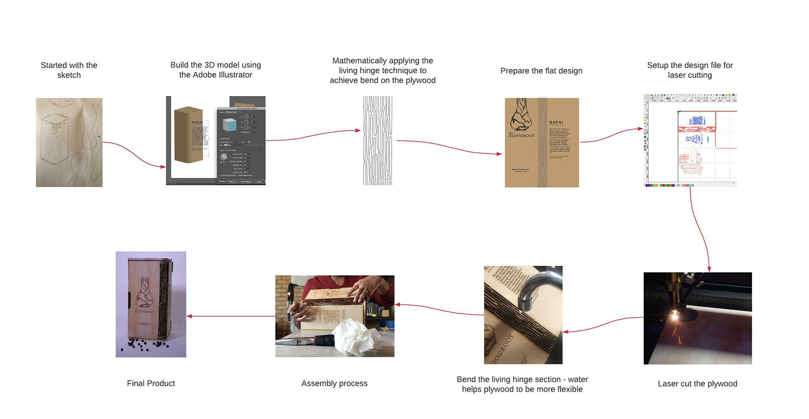
THE PROCESS
FINAL PRODUCT
Want to know more about this project?
Contact me.
marthaweruing@gmail.com
ABOUT ME
I'm a creative strategist and UX designer based in Perth. I often integrating storytelling, design thinking and Human-Centered Design to solve complex problem.
It’s about designing WITH, not just FOR the end user.