PADI App is a mobile app which available for iOS and Android users. The app lets divers locate PADI Dive Centers and Resorts, dive sites, log dives, keep up on scuba news, read about top dive destinations, access PADI eCards™ and much more.
Brief
Final Year study assignment – Support PADI DIVE in their digital transformation process with the best and up-to-date UX practices, trends and high quality UI design for their Mobile App to create impressive experience for divers to complete diverse tasks in one app.
AGDA WA Mentorship Programs 2019
Mentor : Jay Hollywood – Humaan
the users
Primary Audience : PADI divers
Secondary Audience : non-PADI divers and potential divers
01.
User Research
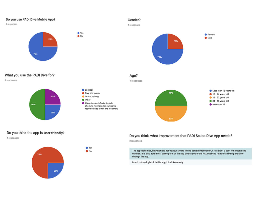
Conducted an online survey for the existing app through the Google Form and distributed to online forums of PADI Divers community to collect information. The information is important to help me develop a solution to meet the goal of this project.
02.
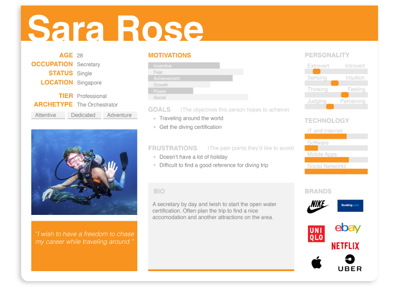
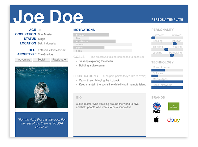
User Persona
Creating user persona is an important step to add in UX design process. It helps me to create a product/service with a spesific, not generic, user in mind. Deep understanding of a target audience is fundamental to creating exceptional products. By understanding the expectations, concerns and motivation of target users, its possible to design a product that will satisfy users needs and therefore be successful.
03.
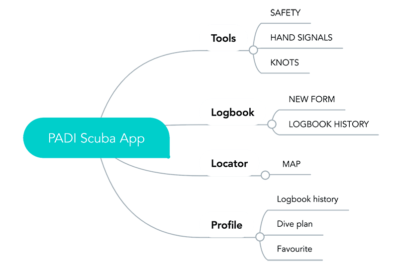
Mind Map
A mind map to navigate the different content pieces on the site and the relationship between them. It is an important step of the user centred process as it ensure content is in places users would expect to find it.
04.
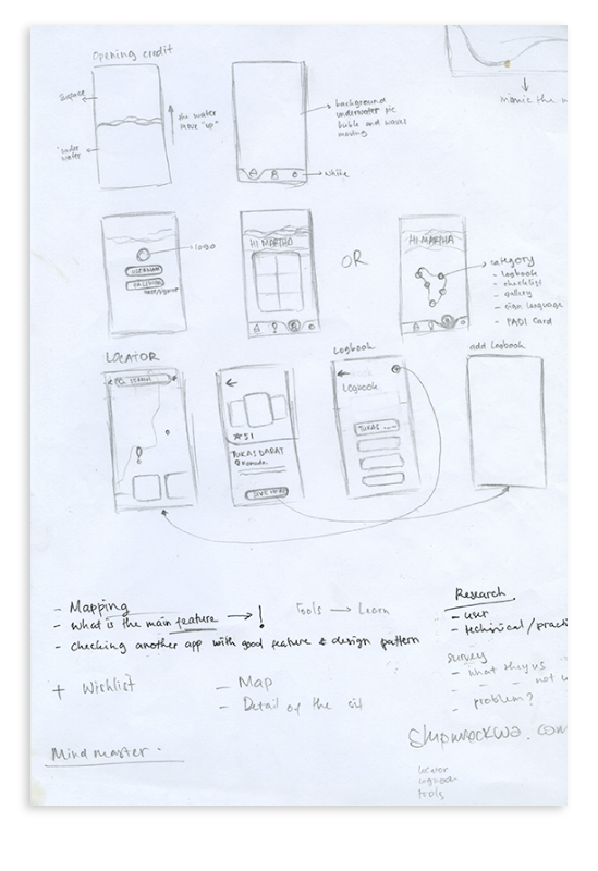
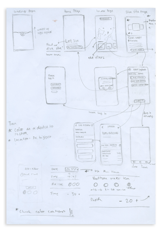
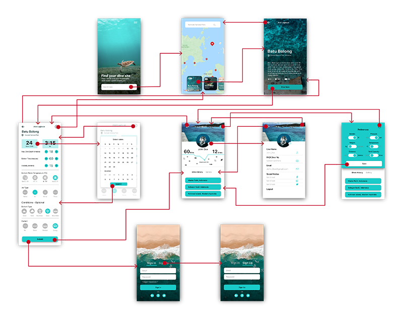
Wireframe
Sketchy and incomplete, that has some characteristics of the target product but is otherwise simple, usually in order to quickly produce the prototype and test broad concepts.
05.
Prototyping
The visual design maximizes the aesthetic, information-conveying capabilities of graphics and text. It’s a subdiscipline within the UX process, contributing to UI Design, information design, and graphic design.
07.
Usability Testing
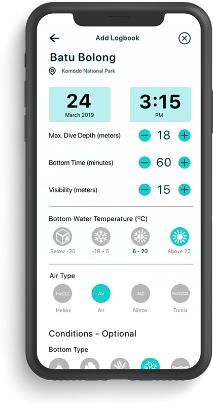
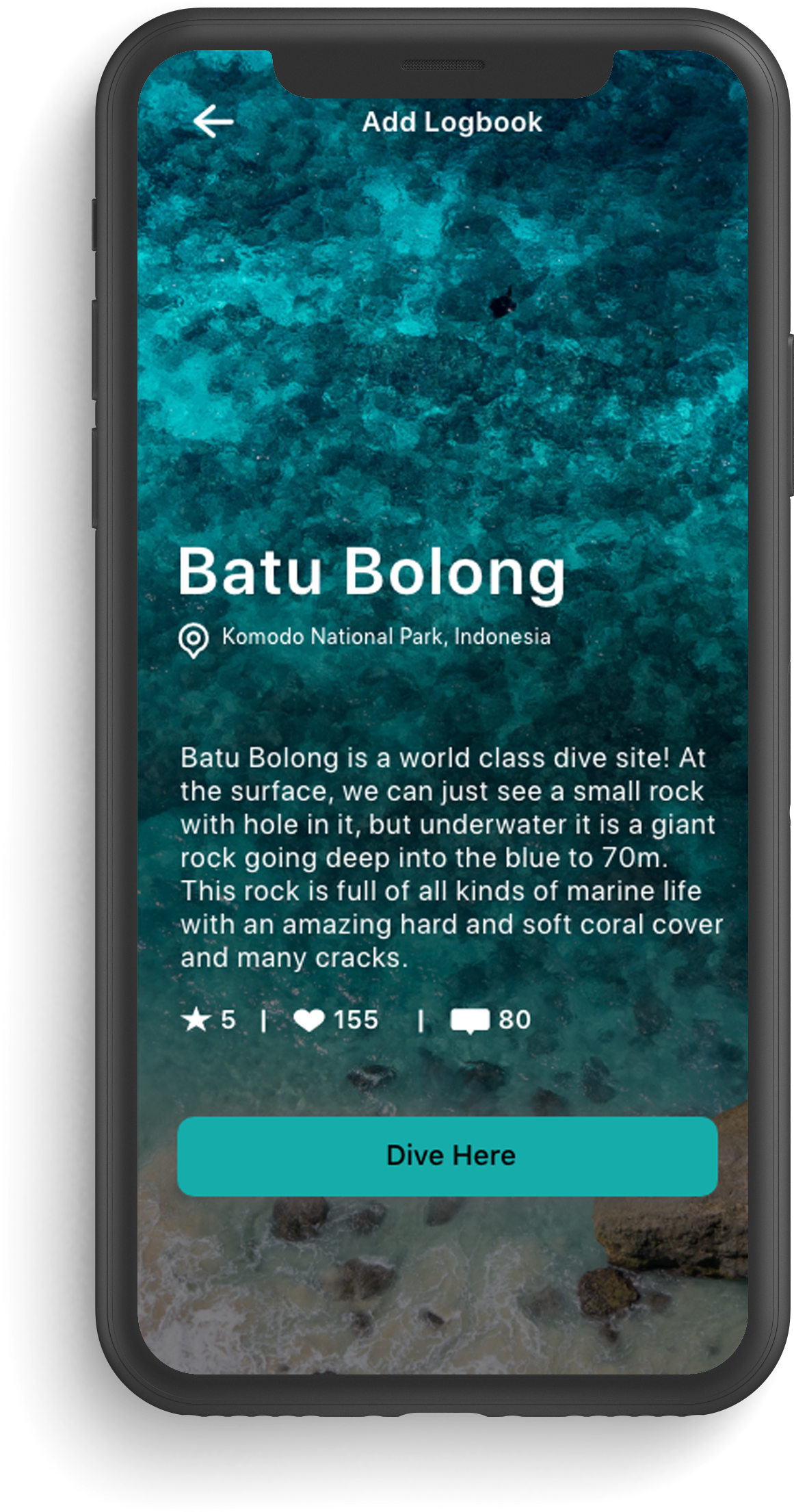
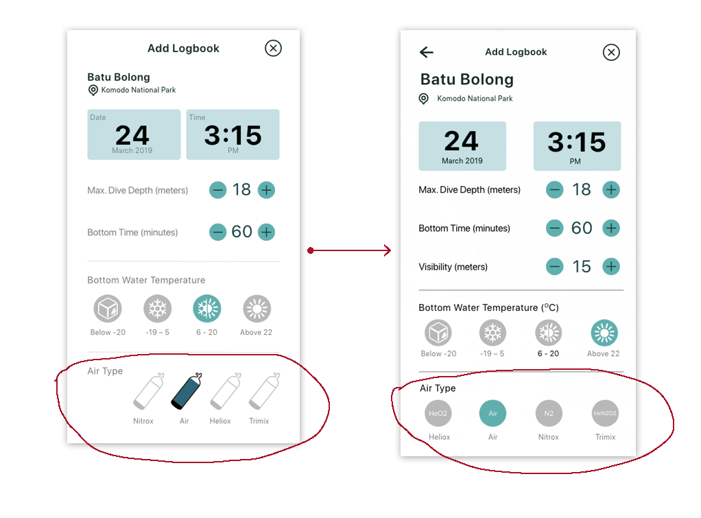
The feedback on the Logbook form focusing on the icon for the Air Type.
In the original design, the icon only shows the differences if someone touches an individual icon to change the color which represents the air type. However, without an activation icon, the user cannot tell the difference.
So I implemented a new design by featuring the periodic table of each element. It will help the user to identify each type of air without choosing each icon.
Want to know more about this project?
Contact me.
marthaweruing@gmail.com
ABOUT ME
I'm a creative strategist and UX designer based in Perth. I often integrating storytelling, design thinking and Human-Centered Design to solve complex problem.
It’s about designing WITH, not just FOR the end user.